Updates to Peloton Equipment Login and Home Page Screens
Did you notice anything different when you logged onto your Peloton equipment today? Peloton has started rolling out some changes to the login and home page screen. We’re currently seeing it on the Bike and Tread and expect the Row to follow suit shortly.
New Login Screen Appearance
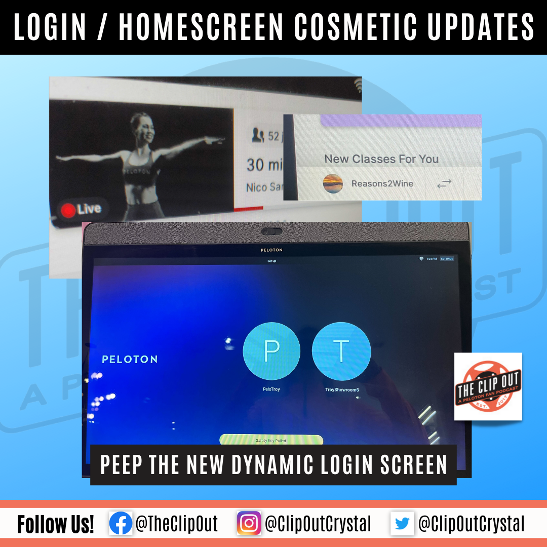
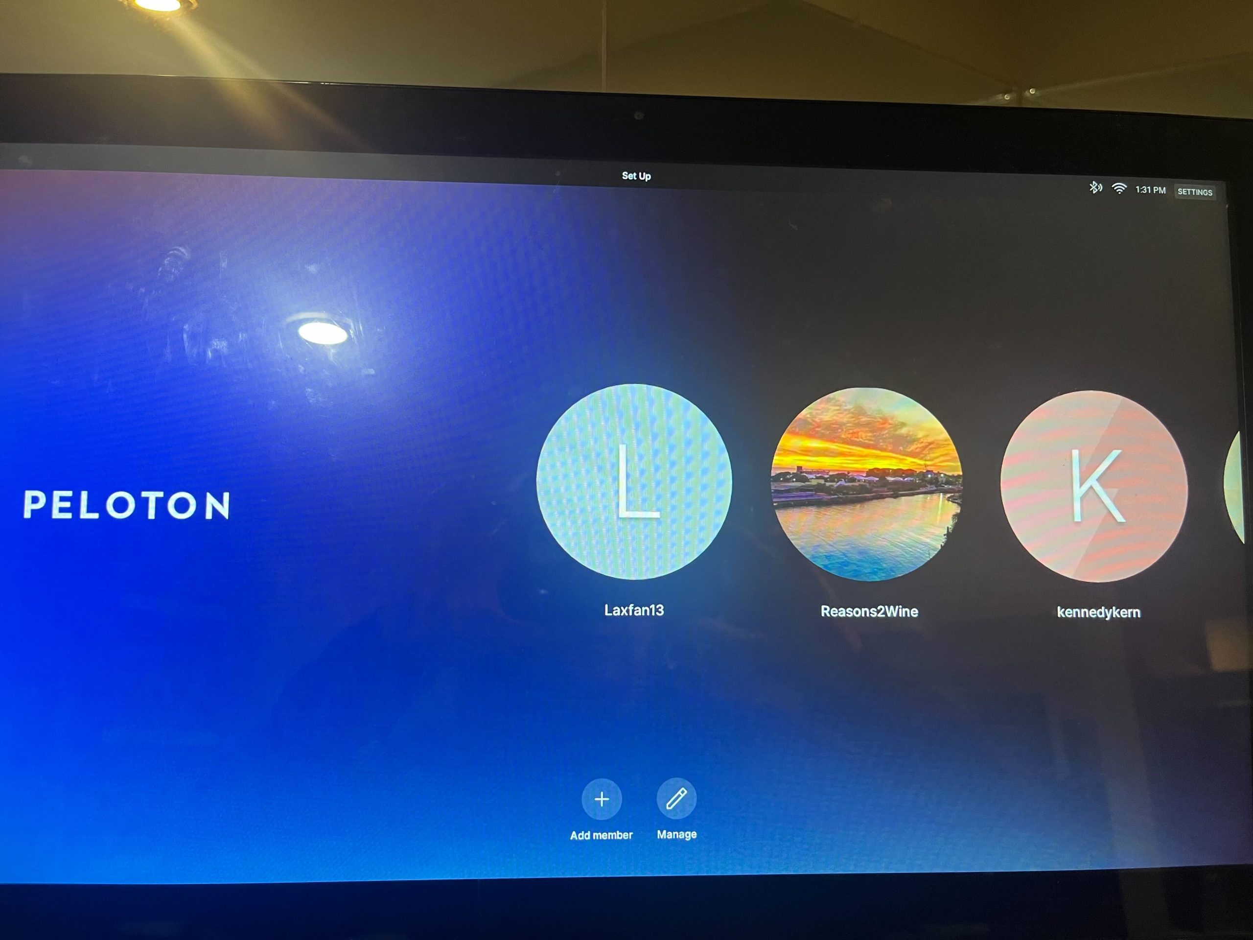
The new login screen features a dynamic blue background instead of the traditional white one, with Peloton branding on the left and user names on the right. The first picture below shows the new screen on the Bike while the second one shows the Tread.
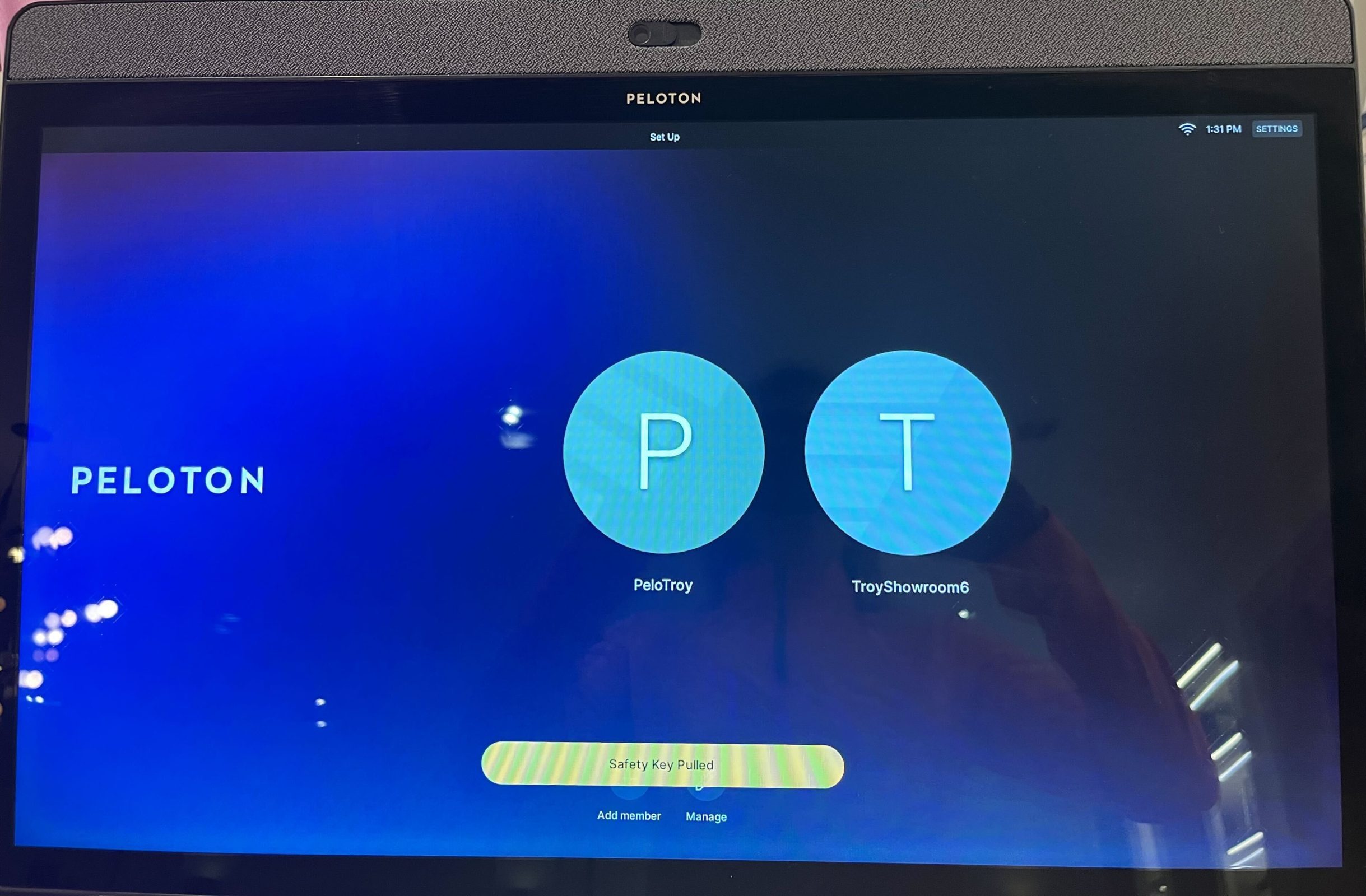
Additional UX Changes
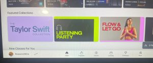
The changes are extending to the equipment home page screen as well. First, a new icon allows you to easily see which classes are currently live when you look in the top right corner.

Additionally, the font has changed on the home screen, and leaderboard names no longer appear on the top.
Did you notice the updates? Let us know if there are any we missed!
Tune in to The Clip Out every Friday to hear Tom and Crystal’s take on this and other hot Pelotopics. We’re available on Apple Podcasts, Spotify, Google Podcasts, iHeart, TuneIn. Be sure and follow us so you never miss an episode. You can also find the show online on Facebook.com/TheClipOut. While you’re there, like the page and join the group. Lastly, find us on our YouTube channel, YouTube.com/TheClipOut, where you can watch all of our shows.
See something in the Peloton Universe that you think we should know? Visit theclipout.com and click on Submit a Tip!
About the Author: Courtney Beck (#DogAndPonyShow)

Latest Podcast

Subscribe
Keep up with all the Peloton news!