
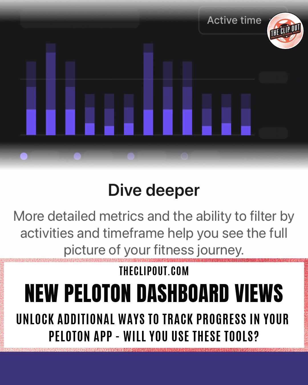
Peloton Dashboard Unlocks New Ways to Track Progress
Peloton Dashboard Launches With Training Load Scale
The upgraded Progress tab organizes fitness data into Training load, Fitness overview, Activity summary, and All time sections.
The Peloton dashboard now organizes fitness data into separate sections, each with its own chart, scale, or comparison. Members can reach it by tapping the fourth icon along the top of the app, the person inside a circle, which opens the Progress tab beside History and Achievements.
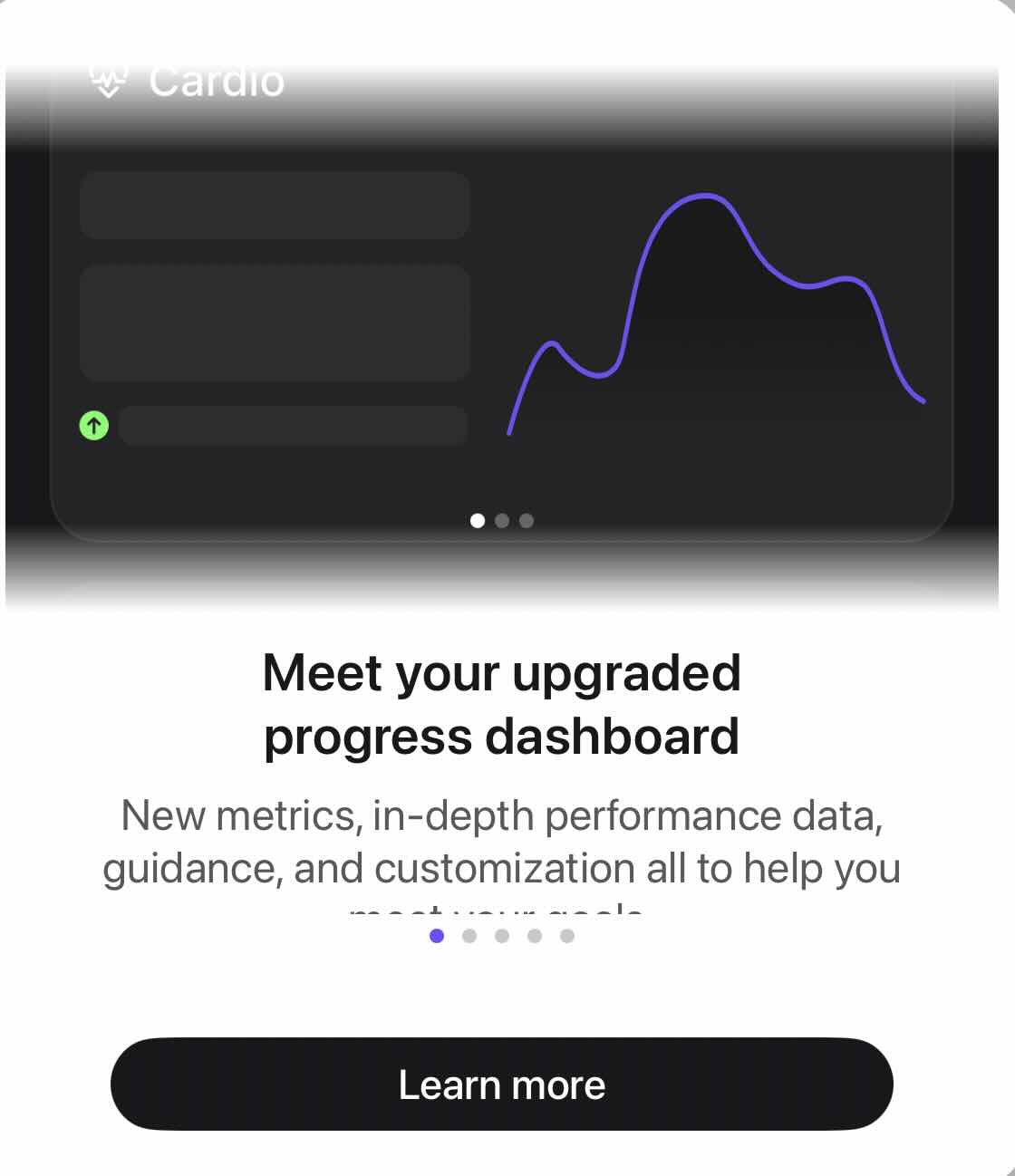
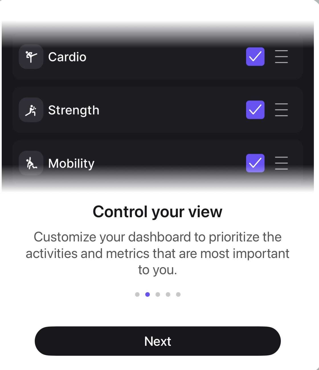
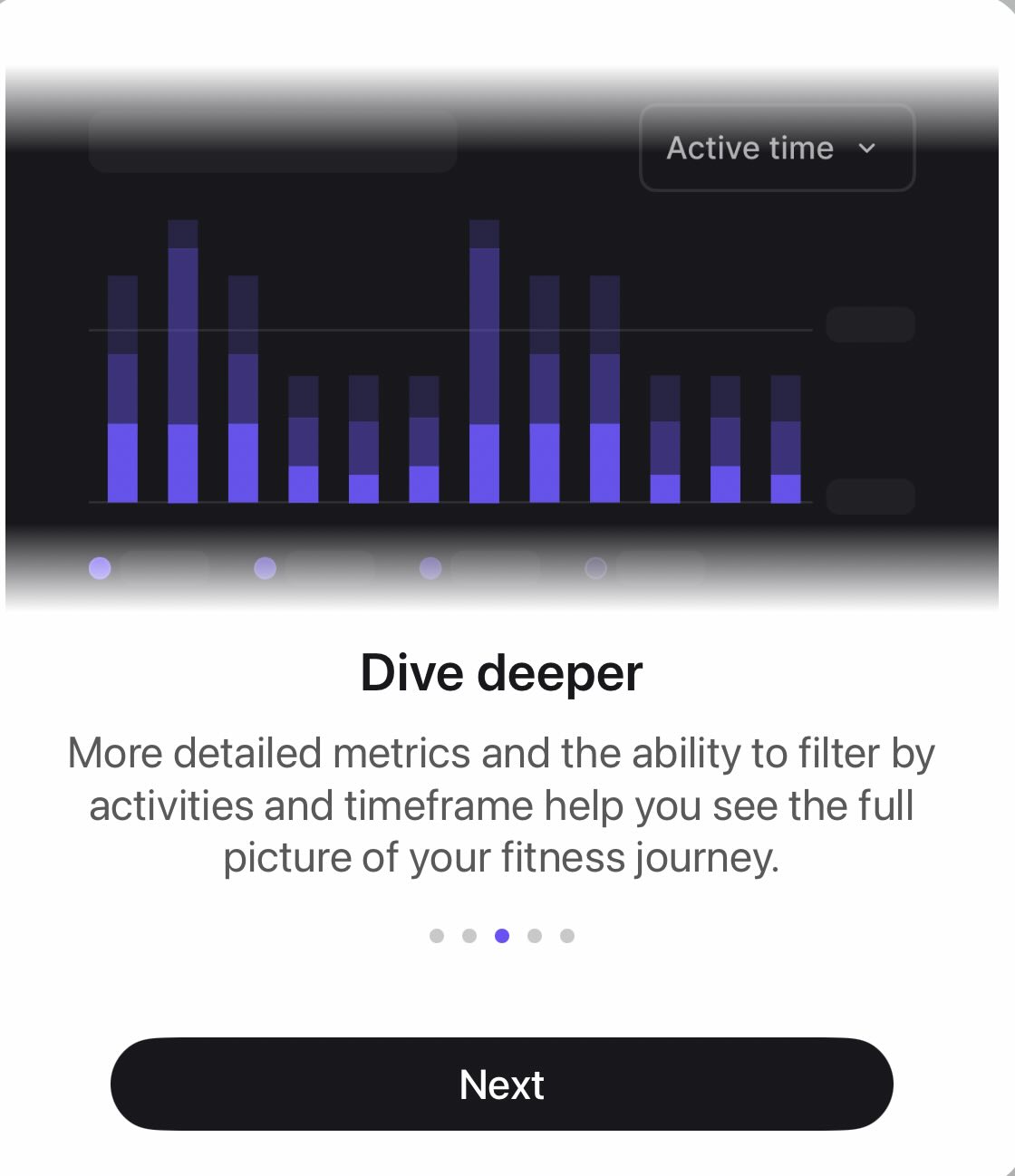
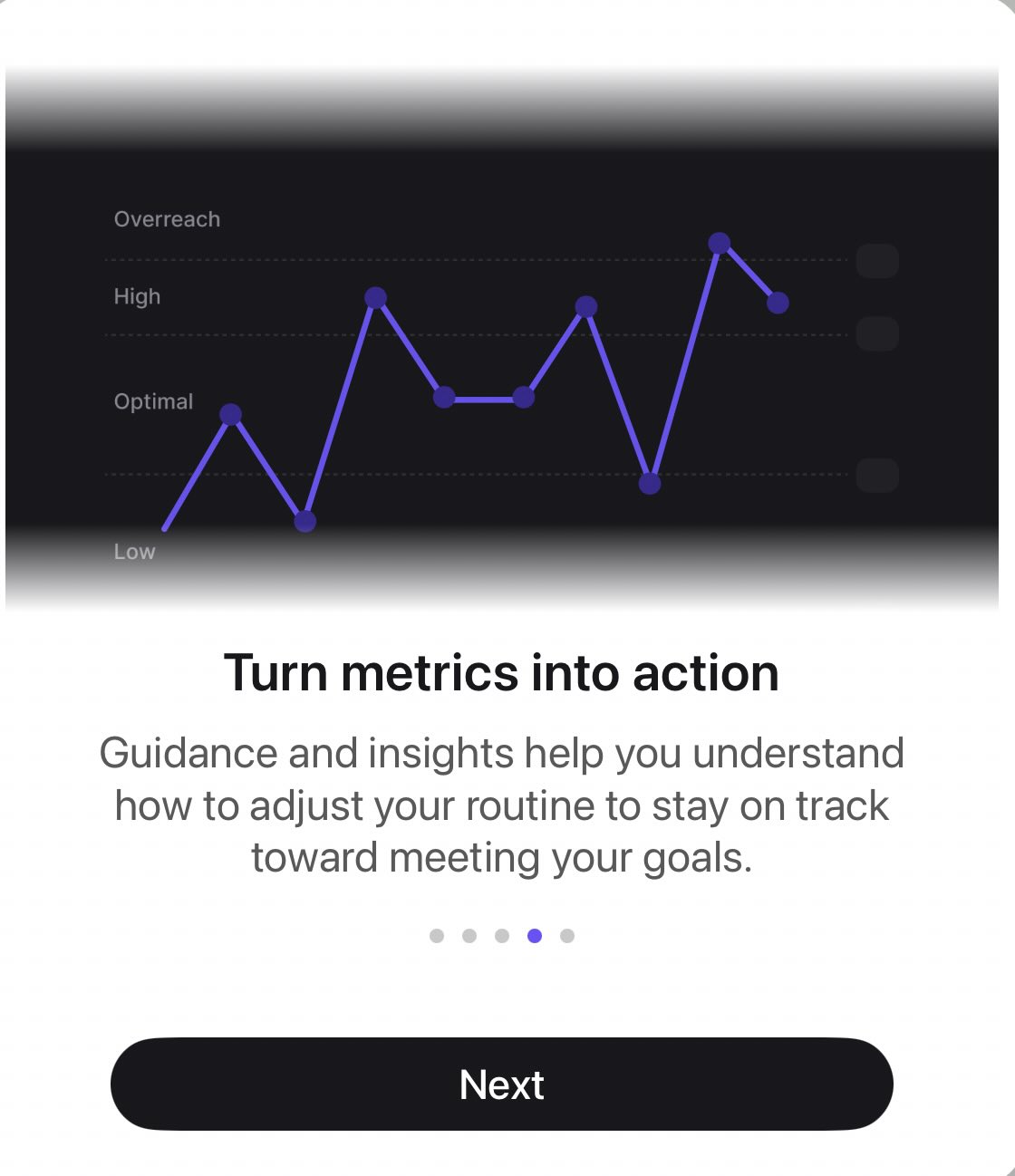
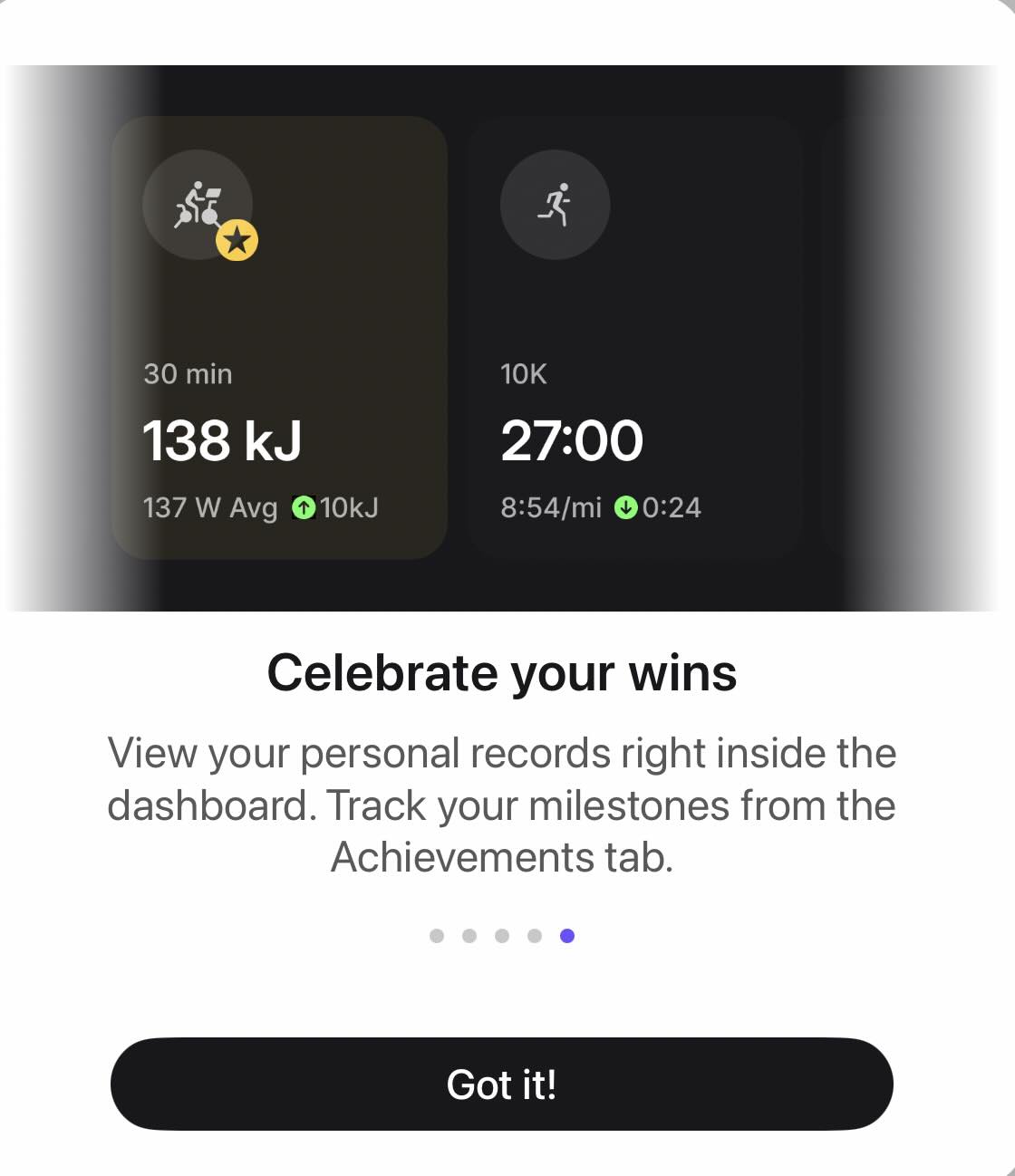
Screenshots from the Peloton app , taken Friday, November 13, show the default layout before customization. A multi-screen walkthrough introduces the Peloton dashboard and describes customization options, filters by activity and timeframe, guidance, and personal records.
How the Peloton Dashboard Is Organized
On the Peloton dashboard, a card at the top reads “Make your dashboard your own” and says members can hide, add, and reorder metrics. Dismiss and Customize dashboard buttons sit below it. Selecting “Customize dashboard” lets members remove views they do not want, and pencil icons sit beside the Fitness overview and Activity summary headings.
Below that, a “Your goal” card carries a pencil icon. A “This month” card pairs workout days and a day streak with a calendar grid of dots by weekday. The “Your plan” card, marked 1 of 4, offers a suggestion tied to a scheduled Mobility Stretch, with an Update plan button and thumbs up and thumbs down icons. This is similar to the earlier iteration of the Peloton dashboard and our coverage of the Personalized Plan rollout this year.
Training Load and Activity Views on the Peloton Dashboard
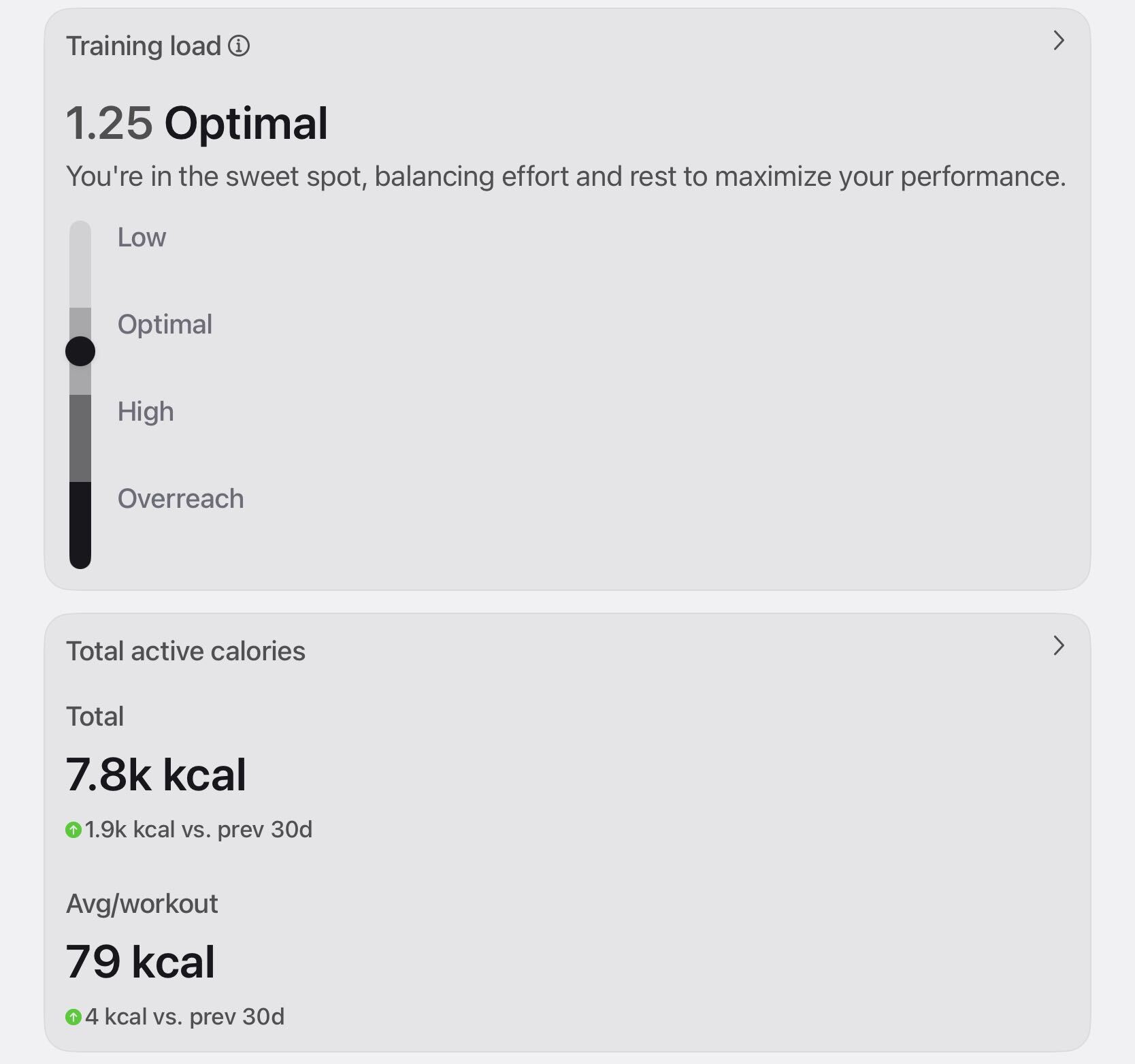
Training load is a new metric built around a scale rather than a bar chart. The card shows a score with a label and a one-line explanation, plus a vertical scale with four zones: Low, Optimal, High, and Overreach. A marker shows where the member currently sits. An information icon and a chevron point to more detail behind the card.
Total active calories appears beneath it with a total and an average per workout, each compared with the previous 30 days.
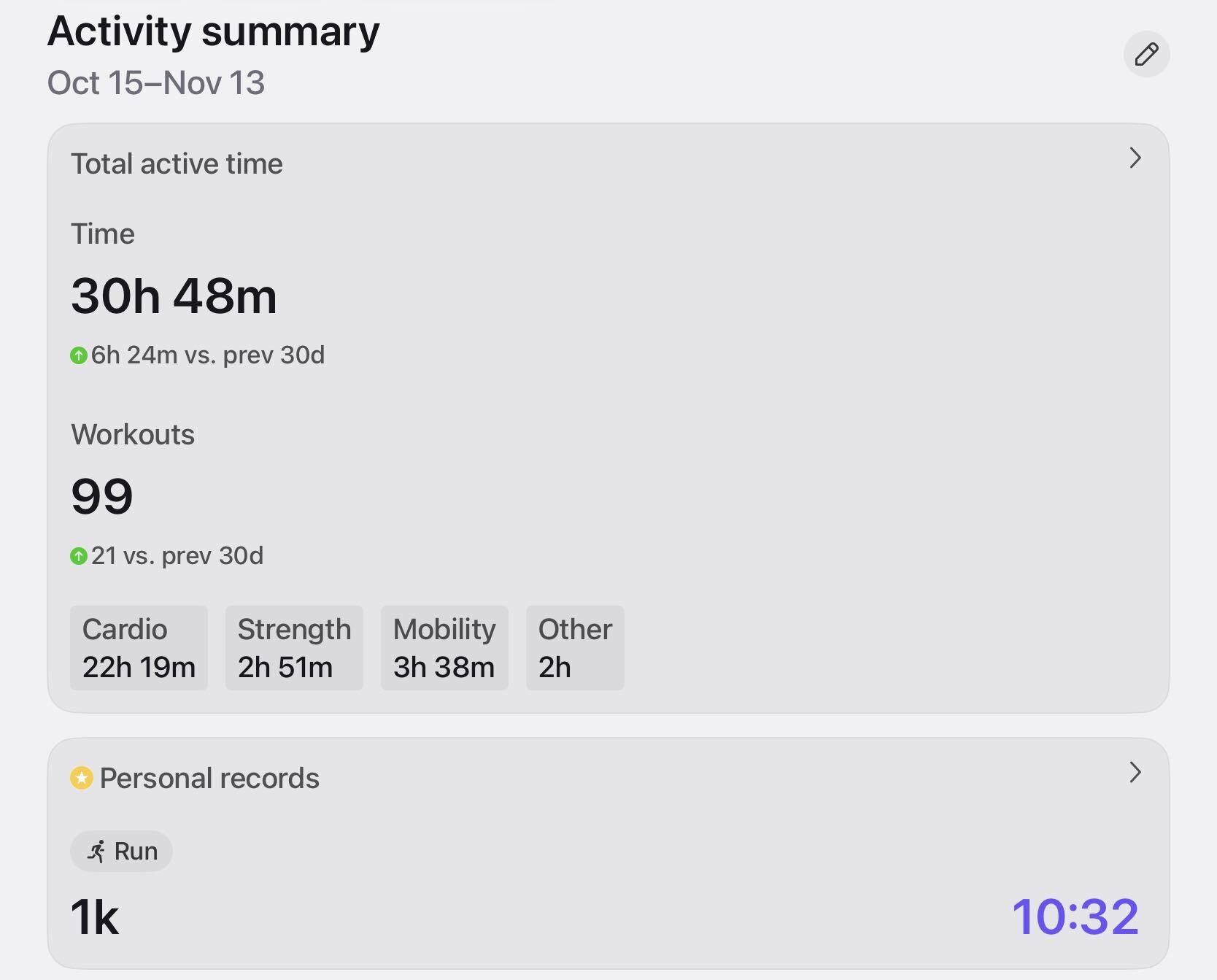
The Activity summary section covers the same Oct 15 to Nov 13 window with a Total active time card. That card lists workout counts and splits time into Cardio, Strength, Mobility, and Other. A Personal records card follows, labeled by activity. Opening the sideways arrow lets you see additional PRs. To be honest, I barely run so I’m not sure why this is the default display for me! When I do customize my views, this is not one that is important to me.
Fitness Overview and All Time Totals
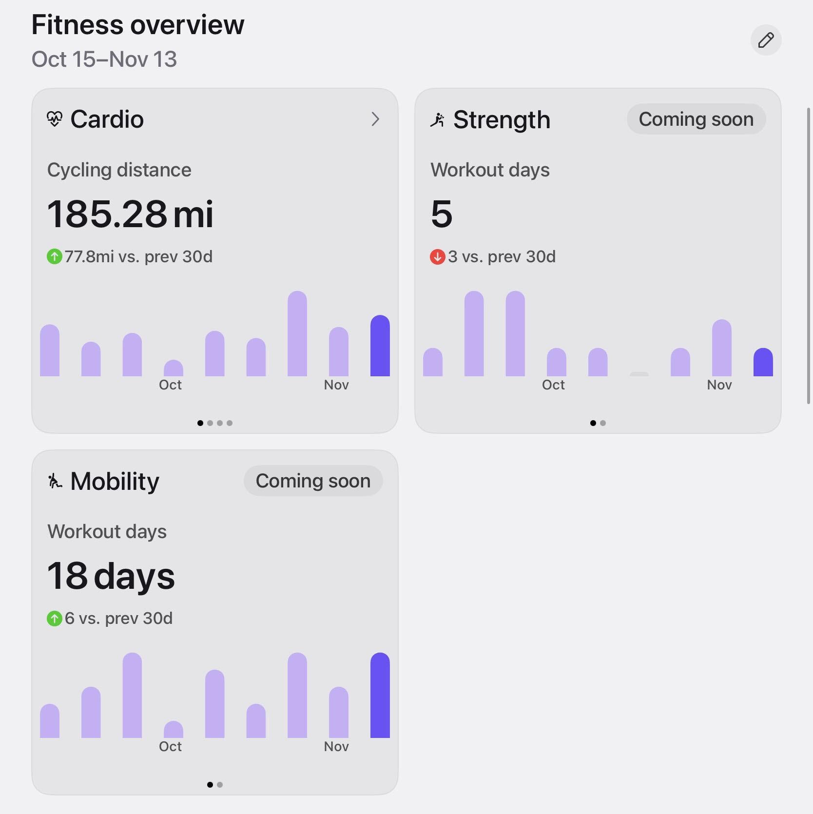
Fitness overview presents Cardio, Strength, and Mobility as three cards. Each has a bar chart spanning October and November (due to when this appeared) and a green or red arrow comparing it with the previous 30 days. Cardio shows cycling distance across four pages. Strength and Mobility show workout days across two.
As of November 13, the Strength and Mobility cards carry “Coming soon” labels, yet both still display workout day counts and charts. It is not clear what data is still missing, and Peloton has not said.
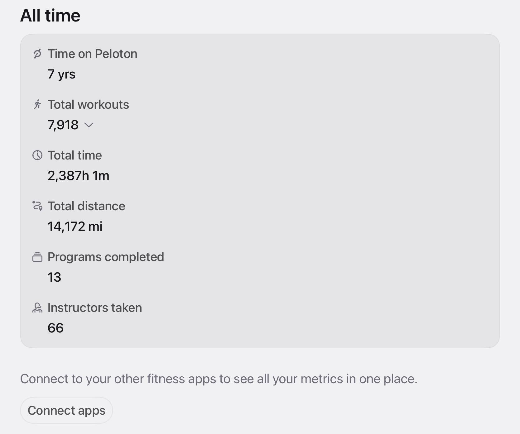
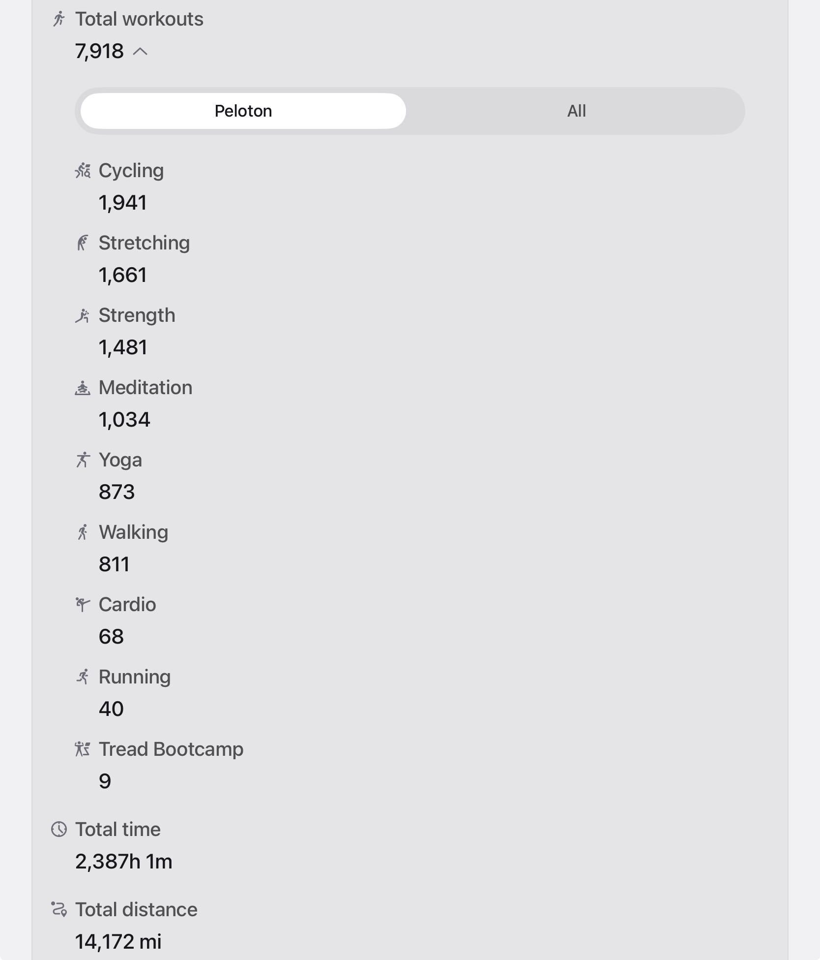
The “All time” section of the Peloton dashboard shows Time on Peloton, Total workouts, Total time, Total distance, Programs completed, and Instructors taken. It also offers a quick way to see how close a total is to a milestone. Total workouts expands into a breakdown by Cycling, Stretching, Strength, Meditation, Yoga, Walking, Cardio, Running, and Tread Bootcamp, with a toggle labeled Peloton and All.
A Connect apps button invites members to link other fitness apps to see all metrics in one place. This builds on Peloton’s robust partnerships with connected fitness peers in 2026.
Peloton has not said what is still to come for the Strength and Mobility cards or how Training load is calculated, which are the open questions on the Peloton dashboard.
Do you like the new dashboard view? How will you use this data?
The Clip Out is an independent Peloton news site with reporting, analysis, and community insights. We deliver breaking updates, feature reporting, and expert context on the stories driving the community and the industry.
Our weekly podcast offers deeper conversation and perspective, and you can find us on Apple Podcasts, Spotify, iHeart, TuneIn, and YouTube Music. You can also follow us on our socials on Facebook, Threads, Instagram, BlueSky, and YouTube.
See something in the Peloton universe that you think we should know? Visit us at theclipout.com and submit a tip.
About the Author: Elizabeth Schlosberg

Latest Podcast


Subscribe
Keep up with all the Peloton news!