Peloton’s Artist Series Collection just got even more inviting
Peloton devices are being updated with a whole new interface for the Artist Series Collection that will make everyone’s favorite artists or that niche cult classic musician so much easier to find.
We’re seeing the changes rolling out already as of June 19, but they likely won’t hit all devices for a few more days. We haven’t seen the changes hit the App yet, but hopefully they’re not too far behind.

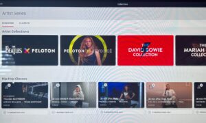
Devices are being updated with a new Artist Series Collection layout.
For me, and for so many Members and Peloton observers, Peloton’s music partnerships are one of their strongest features. With names like Beyoncé, Taylor Swift, and The Beatles on their roster, it’s hard not to be impressed and even excited. Not only do I get to listen to an entire series of classes by some of the best musicians and performers in the world, but I also kind of feel like part of some rock star inner circle knowing these big-name artists think Peloton is cool enough for a partnership. Never mind that it’s probably all businessy marketing stuff–I like to think it means Ed Sheeran thinks Peloton is as cool as I do (which practically makes us friends).
But if you miss an Artist Series when it’s live and want to go find it on-demand, navigating Peloton’s Artist Series Collection for that Alanis Morissette Ride, or the Bad Boy Entertainment Tread Boot Camp, or the Billie Eilish Yoga Flow requires some pretty daunting hurdles… in the form of a whole lot of scrolling. (Notice I didn’t get past the Bs in my list here? That would have taken too long!)
The old layout: Too. Much. Scrolling.
Previously, the Artist Series Collection was one continuous semi-alphabetical list of classes, with no filters for class type, music type, length, etc. I say semi-alphabetical because it looks like the word the does not count when it appears in an artist name, but the word a does, numbers come before letters (but 1975 comes before 2Pac), and punctuation marks (as in the artist name & Juliet) come after numbers but before letters… If reading this list is making your eyes water, that’s sort of how it feels trying scroll through the previous layout to find your artist.
The new layout delivers reduced taps (and scrolls) to workout
We know Peloton has been working hard this year to reduce the taps required to start a workout. This change goes beyond reducing taps to reducing scrolls. So. Many. Scrolls.
To be fair, with the Search feature, you could just search for your artist’s name for a bit of a fast-track, but the results would include all classes containing their songs, not just Artist Series classes that play only their songs, so we’re still talking about more work than most people want to do to find a motivating class.
The Artist Series collection contains hundreds of classes. And in my very unscientific experiment just now, it took me over 4 minutes to scroll down to the Yeah Yeah Yeahs classes added just last month, only to find there is no Run in the series. This is not a delightful user experience. And it took long enough for my waning workout motivation to just about leave my body.
The new layout
Enter the new layout for the Bike/+, Tread/+, and Row (we’ve yet to confirm the changes on the Guide, and the mobile and desktop App are still showing the old way, unfortunately… but hopefully they’re not far behind with an update!). We’re seeing the new layout appear on devices as of June 19, but it will likely take a while to roll out.
The new layout has two tabs. The first tab, labeled Discover, includes the newest artist series right at the top of the page. Below that are several easy-to-browse rows: Artist Collections (these are the flagship collections, like The Beatles, Beyonce, David Bowie, and Mariah Carey), and then individual rows by genre, from Hip Hop and Rock to Indie. This tab makes it easy to narrow the class selection down to a general musical interest, while supporting curious or undecided Members with just the right amount of exploration.

The new Artist Series Collection layout allows you to discover classes through genre-based rows, or search classes with a newly-added filter.
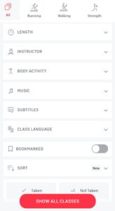
The second tab is labeled Classes. At first glance, this looks like the same old, sad Artist Series class list. But there is one small feature that makes a huge, happy difference: a filter. On the top right, you can select the filter and set the class modality, length, instructor, body activity, music genre, and any of the other options available in the main class library. This feature is great for Members who know exactly what they are looking for in terms of length and modality.

The new Artist Series Collection Classes tab offers a filter to help Members easily get what they want out of their workout.
Connecting you to your musical motivation
With music being one of my favorite deciding factors and motivators for a workout, the Artist Series Collection has always kind of felt like a buried treasure of sorts. Like I knew it had more classes I would love to take, but I just never really felt like digging far enough to find them. But now Peloton is laying the treasure out for all of us to find and enjoy… like music-loving pirates.
Are you as excited about this feature as I am? We’d love to hear if it made a difference in your next class selection. Share your thoughts in the comments!
Tune in to The Clip Out every Friday to hear Tom and Crystal’s take on this and other hot Pelotopics. We’re available on Apple Podcasts, Spotify, Google Podcasts, iHeart, TuneIn. Be sure and follow us so you never miss an episode. You can also find the show online on Facebook.com/TheClipOut. While you’re there, like the page and join the group. Lastly, find us on our YouTube channel, YouTube.com/TheClipOut, where you can watch all of our shows.
See something in the Peloton Universe that you think we should know? Visit theclipout.com and click on Submit a Tip!
Latest Podcast

Subscribe
Keep up with all the Peloton news!


