Power Zone Graphs Appearing in Workout History – Rejoice!
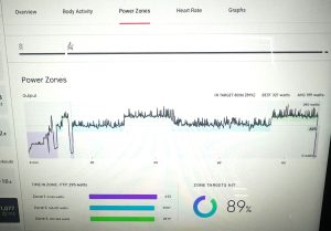
We have good news for Power Zone riders. Peloton has added Power Zone graphs to the post-ride workout summary screen on the Bike and Bike+. Until now, the workout summary for Power Zone rides was identical to all other rides, in that post-ride metrics included information related to heart rate zones, speed, and cadence. Now, Power Zone graphs have been added to Power Zone specific rides. Until recently, Peloton riders had to rely on third-party applications or websites such as mPaceline or Power Zone Pack to obtain post-ride Power Zone graphs.
In addition to the Power Zone graphs, the post-ride metrics will tell you the % of your ride where you actually rode in the target zone and will give you the specific time breakdown spent in each of the target zones. Time spent above or below the zone does not appear to be calculated at this time.
Not all Power Zone rides will display this information. Like the introduction to the Power Zone indicator bar, it appears as if this new Power Zone graph feature is limited to Power Zone rides from 2022 and later.
Here is a screenshot of a recent Power Zone ride graph:

At this time, we don’t know if this feature is available to everyone or is being rolled out selectively. I checked my Bike today and was able to view the Power Zone graphs.
Have you seen the new Power Zone graphs on your Bike or Bike+? Let us know!
Tune in to The Clip Out every Friday to hear Tom and Crystal’s take on this and other hot Pelotopics. We’re available on Apple Podcasts, Spotify, Google Podcasts, iHeart, TuneIn. Be sure and follow us so you never miss an episode. You can also find the show online on Facebook.com/TheClipOut. While you’re there, like the page and join the group. Lastly, find us on our YouTube channel, YouTube.com/TheClipOut, where you can watch all of our shows.
See something in the Peloton Universe that you think we should know? Visit theclipout.com and click on Submit a Tip!

Subscribe
Keep up with all the Peloton news!


